Mantine Components Gallery
MantineのReactコンポーネント一覧
Blockquote with optional cite
Life is like an npm install – you never know what you are going to get.– Forrest Gump
Color
Inline or block code without syntax highlight
React.createElement()Highlight given part of a string with mark tag
Highlight This, definitely THIS and also this!
HighlightColor
Display ordered or unordered list
- Clone or download repository from GitHub
- Install dependencies with yarn
- To start development server run npm start command
- Run tests to make sure your changes do not break the build
- Submit a pull request once you are done
Type
Size
xs
sm
md
lg
xl
Highlight part of the text
Highlight this chunk of the text
Color
Render table with theme styles
| Element position | Element name | Symbol | Atomic mass |
|---|---|---|---|
| 6 | Carbon | C | 12.011 |
| 7 | Nitrogen | N | 14.007 |
| 39 | Yttrium | Y | 88.906 |
| 56 | Barium | Ba | 137.33 |
| 58 | Cerium | Ce | 140.12 |
Display text and links with theme styles
Extra small text
Small text
Default text
Large text
Extra large text
Semibold
Bold
Italic
Underlined
Strikethrough
Dimmed text
Blue text
Teal 4 text
Uppercase
capitalized text
Aligned to center
Aligned to right
h1-h6 headings
This is h1 title
This is h2 title
This is h3 title
This is h4 title
This is h5 title
This is h6 title
Icon button
Color
Size
xs
sm
md
lg
xl
Radius
xs
sm
md
lg
xl
Render button or link with button styles from mantine theme
Color
Radius
xs
sm
md
lg
xl
Size
xs
sm
md
lg
xl
ActionIcon with close icon
Copies given text to clipboard
Open file picker with a button click
Unstyled polymorphic button
Autocomplete user input with any list of options
Radius
xs
sm
md
lg
xl
Size
xs
sm
md
lg
xl
Capture boolean input from user
LabelPosition
Color
Radius
xs
sm
md
lg
xl
Size
xs
sm
md
lg
xl
Pick one or multiple values with inline controls
Color
Variant
Size
xs
sm
md
lg
xl
Radius
xs
sm
md
lg
xl
Capture color data from user
Inline color picker
rgba(47, 119, 150, 0.7)
Capture files from user
Radius
xs
sm
md
lg
xl
Size
xs
sm
md
lg
xl
Base component to create custom inputs
Variant
Radius
xs
sm
md
lg
xl
Size
xs
sm
md
lg
xl
Capture json data from user
Radius
xs
sm
md
lg
xl
Size
xs
sm
md
lg
xl
Custom searchable multi select
Radius
xs
sm
md
lg
xl
Size
xs
sm
md
lg
xl
Capture user feedback limited to large set of options
This is anonymous
Radius
xs
sm
md
lg
xl
Size
xs
sm
md
lg
xl
Capture number input from user
Radius
xs
sm
md
lg
xl
Size
xs
sm
md
lg
xl
Capture password from user with option to toggle visibility
Password must include at least one letter, number and special character
Radius
xs
sm
md
lg
xl
Size
xs
sm
md
lg
xl
Wrapper for input type radio
LabelPosition
Size
xs
sm
md
lg
xl
Color
Rating Component
Color
Size
xs
sm
md
lg
xl
Horizontal control with multiple segments
Color
Custom searchable select
Radius
xs
sm
md
lg
xl
Size
xs
sm
md
lg
xl
Capture user feedback from a range of values
20%
50%
80%
Type
Color
Size
xs
sm
md
lg
xl
Radius
xs
sm
md
lg
xl
Capture boolean input from user
LabelPosition
Size
xs
sm
md
lg
xl
Radius
xs
sm
md
lg
xl
Color
Capture string input from user
Radius
xs
sm
md
lg
xl
Size
xs
sm
md
lg
xl
Renders textarea with optional autosize variant
Radius
xs
sm
md
lg
xl
Size
xs
sm
md
lg
xl
Attract user attention with important static message
Bummer!
Color
Radius
xs
sm
md
lg
xl
Variant
Indicate loading state
Color
Size
xs
sm
md
lg
xl
Variant
Show dynamic notifications and alerts to user, part of notifications system
We notify you that
You are now obligated to give a star to Mantine project on GitHub
We notify you that
You are now obligated to give a star to Mantine project on GitHub
Color
Radius
xs
sm
md
lg
xl
Give user feedback for status of the task
Color
Radius
xs
sm
md
lg
xl
Size
xs
sm
md
lg
xl
Give user feedback for status of the task with circle diagram
Indicate content loading state
Divide content into collapsible sections
Colors, fonts, shadows and many other parts are customizable to fit your design needs
Radius
xs
sm
md
lg
xl
ChevronPosition
Display user profile image, initials or fallback icon
Variant
Radius
xs
sm
md
lg
xl
Size
xs
sm
md
lg
xl
Color
Displays image as background
BackgroundImage component can be used to add any content on image. It is useful for hero headers and other similar sections
Radius
xs
sm
md
lg
xl
Display badge, pill or tag
Badge
Color
Size
xs
sm
md
lg
xl
Radius
xs
sm
md
lg
xl
Card with context styles for Image and Divider components
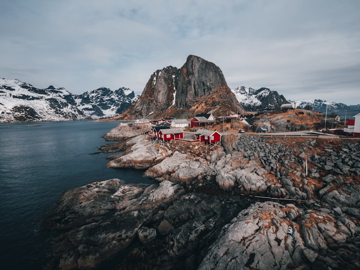
Norway Fjord Adventures
On Sale
With Fjord Tours you can explore more of the magical fjord landscapes with tours and activities on and around the fjords of Norway
Display color swatch
Image with optional placeholder for loading and error state

Display element at the corner of another element
Color
Radius
xs
sm
md
lg
xl
Display keyboard button or keys combination
⌘ + shift + M
Hide long sections of content under spoiler

We Butter the Bread with Butter was founded in 2007 by Marcel Neumann, who was originally guitarist for Martin Kesici's band, and Tobias Schultka. The band was originally meant as a joke, but progressed into being a more serious musical duo. The name for the band has no particular meaning, although its origins were suggested from when the two original members were driving in a car operated by Marcel Neumann and an accident almost occurred. Neumann found Schultka "so funny that he briefly lost control of the vehicle." Many of their songs from this point were covers of German folk tales and nursery rhymes.
Render icon inside element with theme colors
Radius
xs
sm
md
lg
xl
Size
xs
sm
md
lg
xl
Color
Display list of events in chronological order
New branch
You've created new branch fix-notifications from master
2 hours ago
Commits
You've pushed 23 commits to fix-notifications branch
52 minutes ago
Pull request
You've submitted a pull request Fix incorrect notification message (#187)
34 minutes ago
Code review
Robert Gluesticker left a code review on your pull request
12 minutes ago
Maintain responsive consistent width/height ratio

Centers content vertically and horizontally
All elements inside Center are centered
Center content horizontally with predefined max-width
Default container
xs container with xs horizontal padding
200px container with 0px horizontal padding
Compose elements in a flex container
Gap
xs
sm
md
lg
xl
Flexbox grid system with variable amount of columns
1
2
3
Compose elements and components in a horizontal flex container
Spacing
xs
sm
md
lg
xl
Apply styles to children if media query matches
- larger than lg
- Smaller than lg
- Smaller than xl, larger than sm
- Smaller than 1500px, larger than 800px
Responsive grid where each item takes equal amount of space
1
2
3
4
5
Spacing
xs
sm
md
lg
xl
VerticalSpacing
xs
sm
md
lg
xl
Add horizontal or vertical spacing from theme
First line
Second line
H
xs
sm
md
lg
xl
Compose elements and components in vertical flex container
Spacing
xs
sm
md
lg
xl
Display links with theme styles
Separate list of react nodes with given separator
Open/close navigation button
Navigation link
Display active page and navigate between multiple pages
Color
Size
xs
sm
md
lg
xl
Radius
xs
sm
md
lg
xl
Display content divided into a steps sequence
Color
Radius
xs
sm
md
lg
xl
Size
xs
sm
md
lg
xl
Switch between different views
Gallery tab content
Messages tab content
Settings tab content
Color
Variant
Radius
xs
sm
md
lg
xl
Orientation
Display fixed overlay at any side of the screen
Display overlay area at any side of the screen
Display popover section when target element is hovered
Overlay over given container with centered Loader
Combine a list of secondary actions into single interactive area
Modal with optional header
Overlays given element with div element with any color and opacity
Display popover section relative to given target element
Renders tooltip at given element on mouse over or other event
Color
Add inline styles to any element or component with sx
Box lets you add inline styles with sx prop
Animate presence with slide down transition
Horizontal line with optional label or vertical divider
Trap focus at child node
Renders white or dark background depending on color scheme
Paper is the most basic ui component
Use it to create cards, dropdowns, modals and other components that require background with shadow
Shadow
xs
sm
md
lg
xl
Radius
xs
sm
md
lg
xl
Padding
xs
sm
md
lg
xl
Area with custom scrollbars
Animate presence of component with premade animations
fade
scale
scale-y
scale-x
skew-up
skew-down
rotate-left
rotate-right
slide-down
slide-up
slide-left
slide-right
pop
pop-bottom-left
pop-bottom-right
pop-top-left
pop-top-right
Embla based carousel component
Align
Orientation
SlideGap
xs
sm
md
lg
xl
ControlsOffset
xs
sm
md
lg
xl
Capture files from user with drag and drop
Drag images here or click to select files
Attach as many files as you like, each file should not exceed 5mb
Navigation progress bar
Command center for your application